CLIENT: Bell Chemicals
INDUSTRY: Industrial Chemicals
PROJECT: Brand refresh and expansion
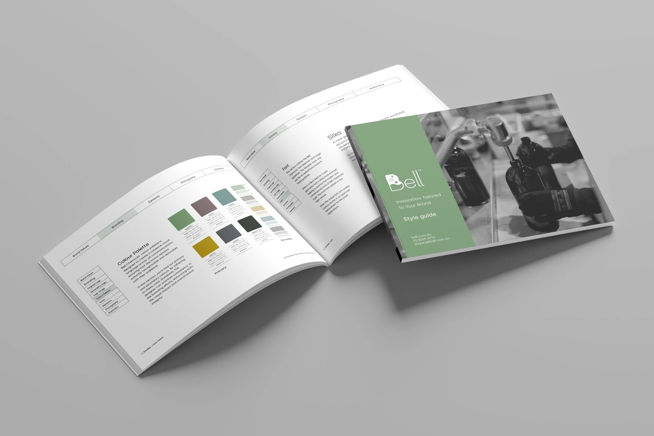
CHANNELS: Print, Digital, Photography, Trade Shows, Brand Guidelines
Bell Chemicals
Bell Chemicals is an Australian manufacturer of specialist cleaning and chemical solutions.
While the business had built a strong reputation, its visual identity no longer reflected the innovation, professionalism and bespoke quality behind its products.
I was tasked with evolving the existing identity into a refined brand system that could support future growth while preserving the recognition the company had already established.
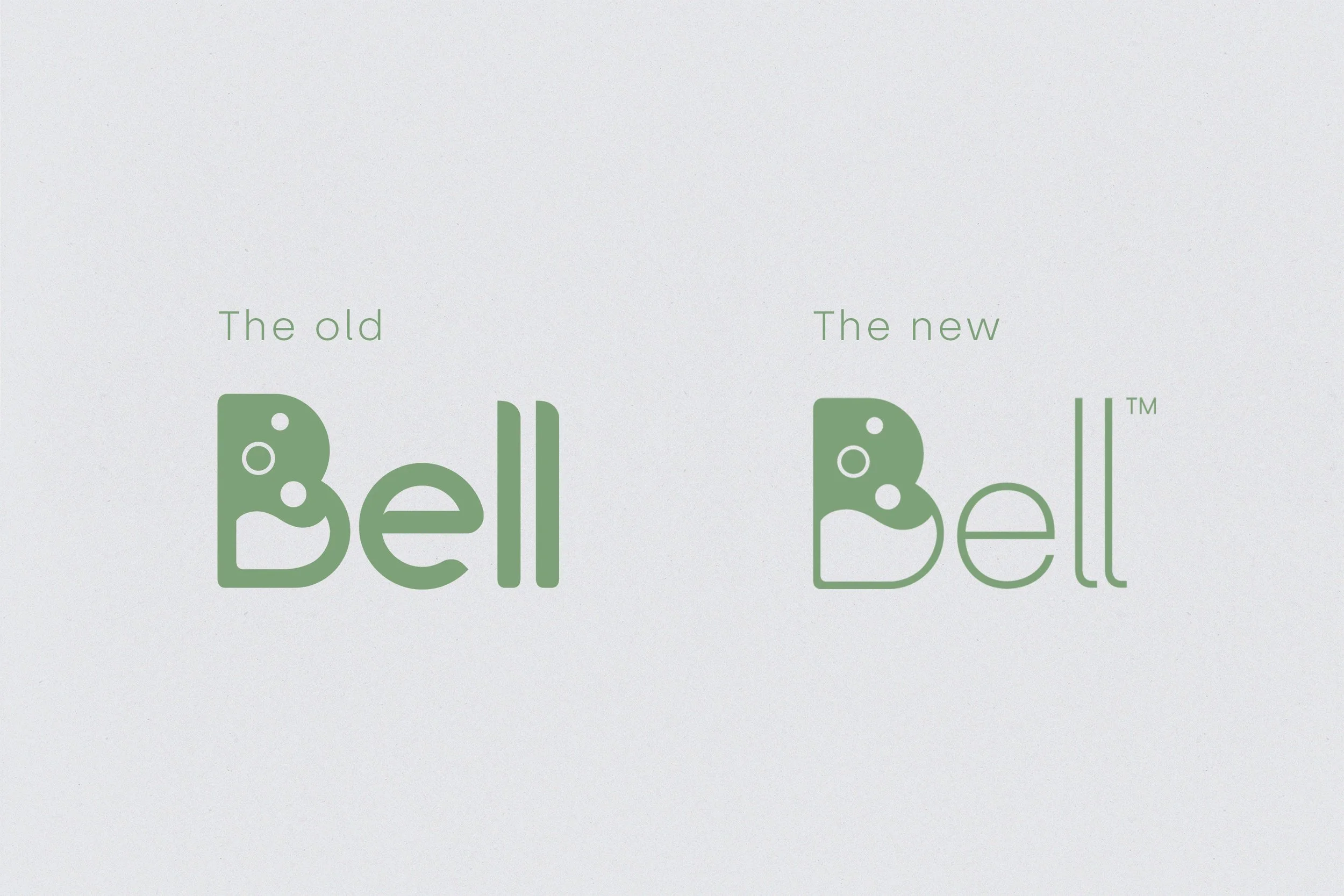
The original Bell Chemicals logo relied on thick, heavy forms that often dominated supporting designs and collateral. As the brand evolved, the identity no longer reflected the company's innovative direction and felt dated alongside competitors.
The refreshed logo introduces a cleaner, lighter aesthetic that better communicates the brand's modern, professional, and forward-thinking positioning while improving flexibility across print and digital applications.
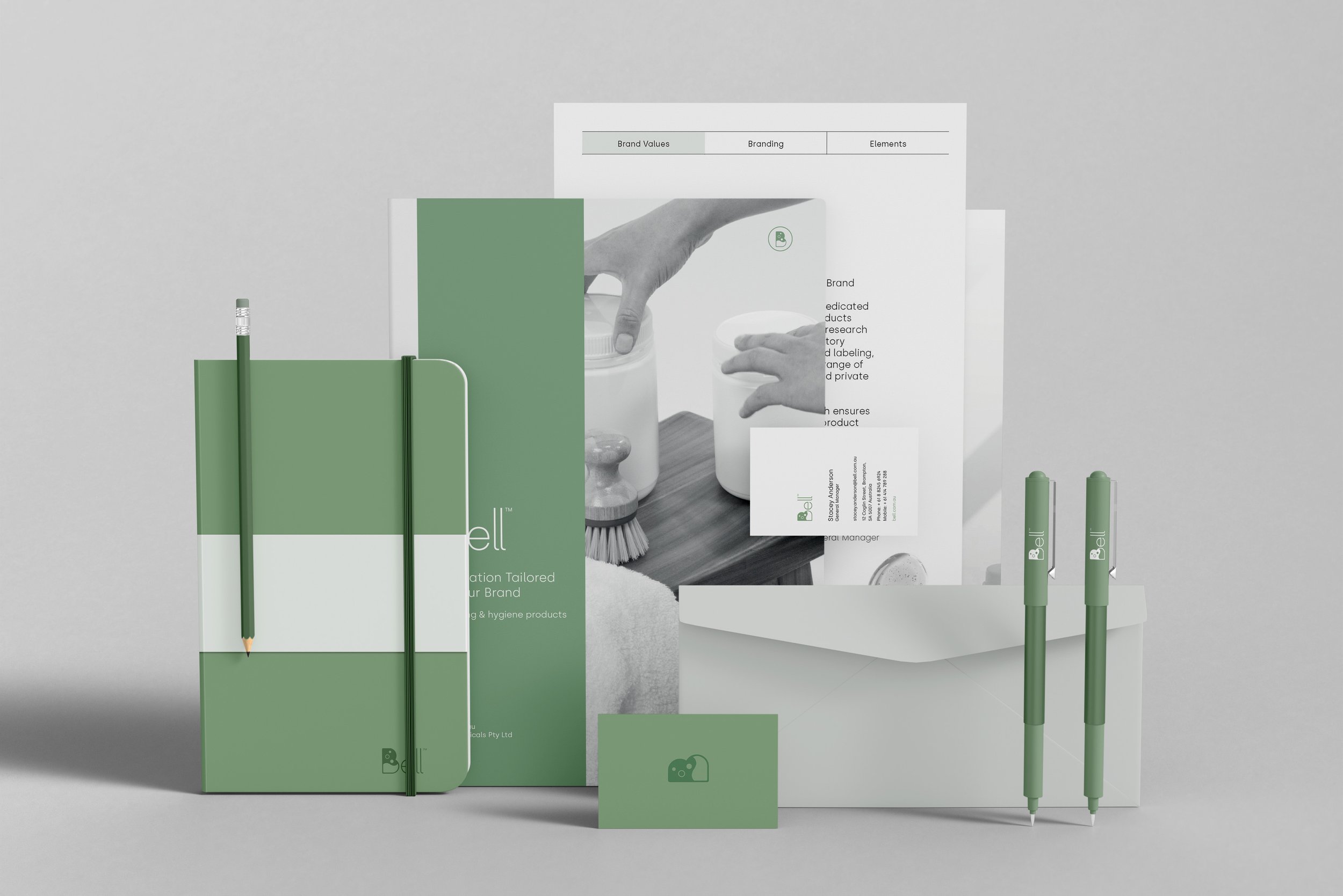

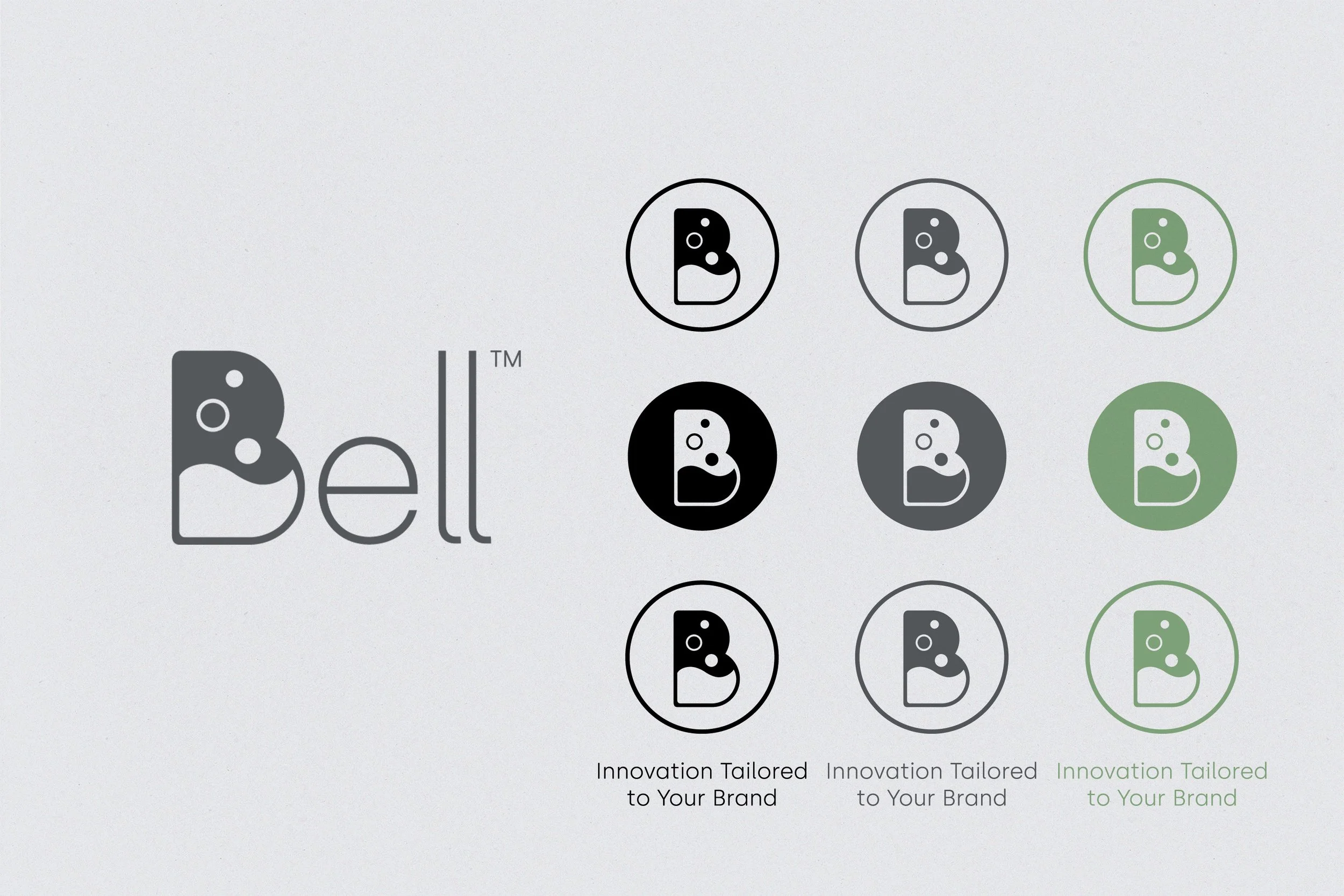



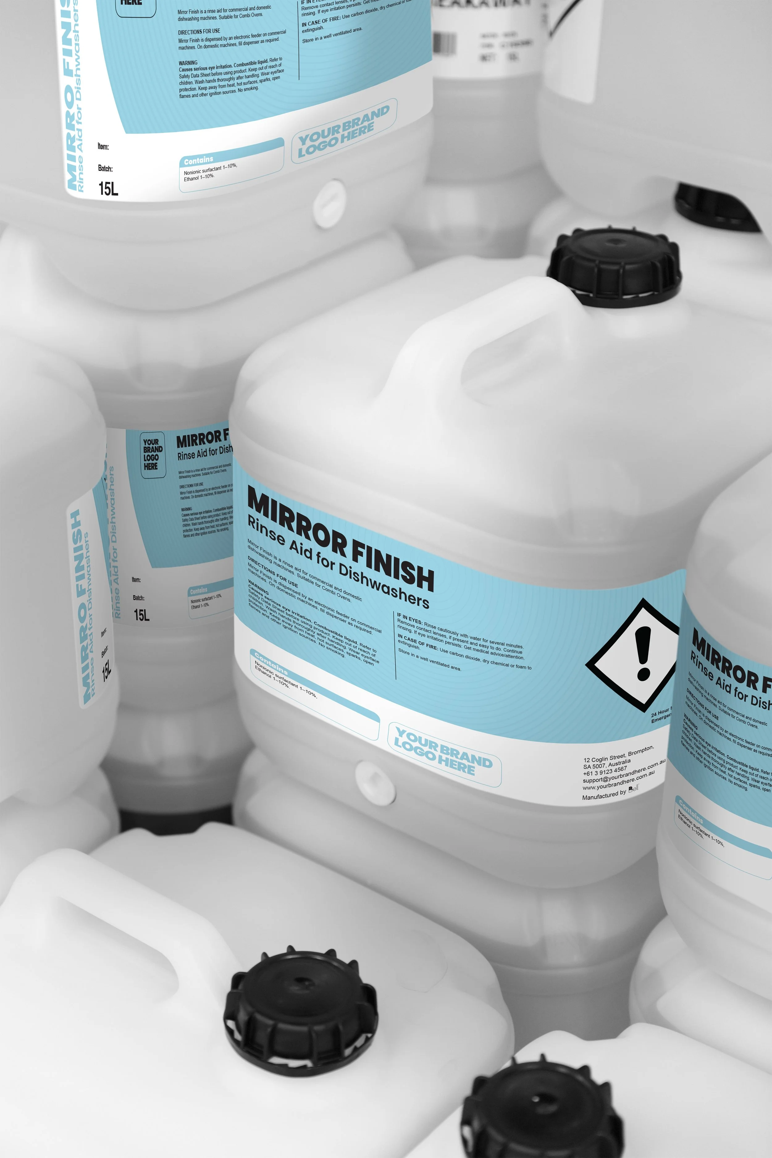
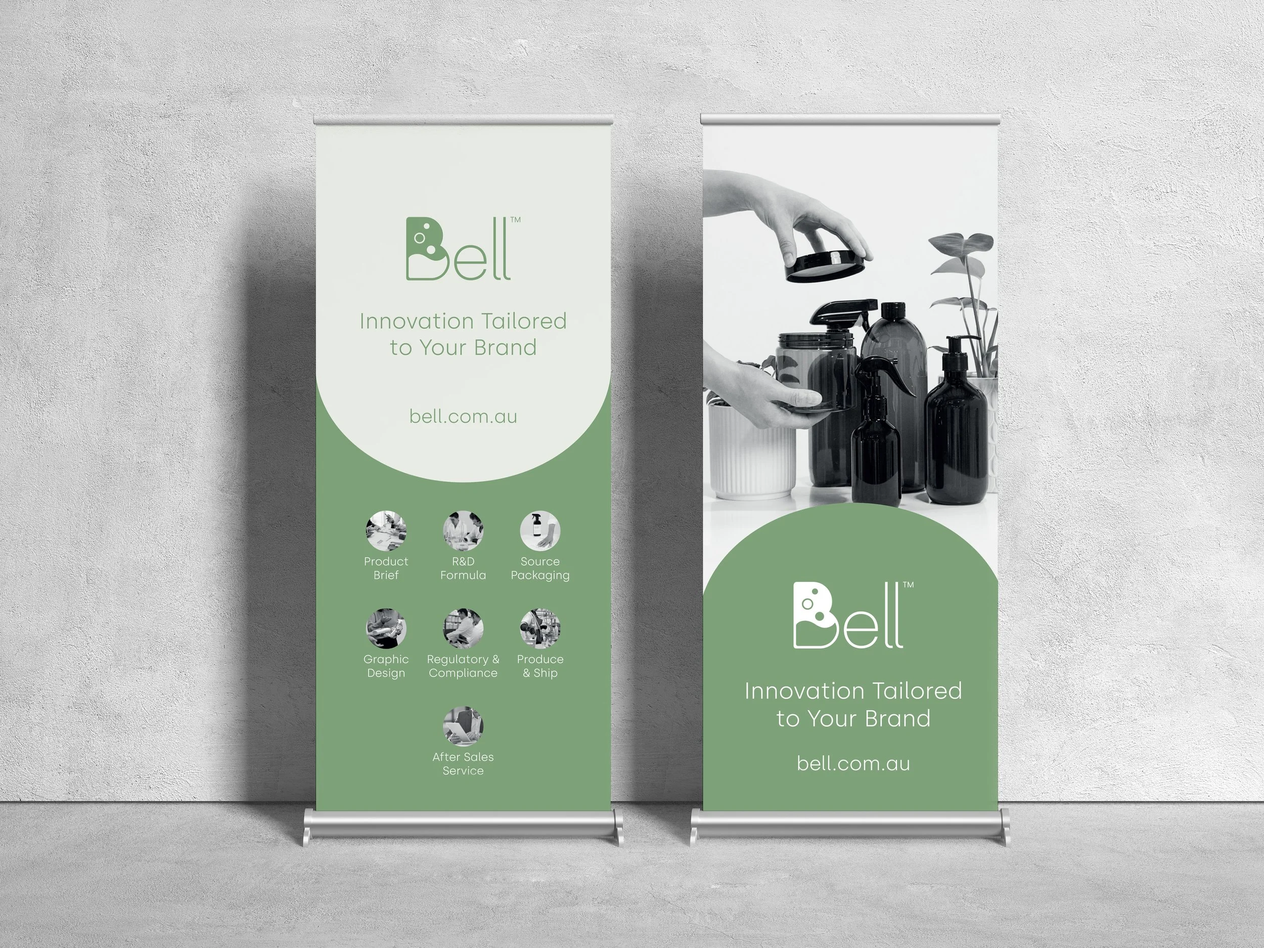
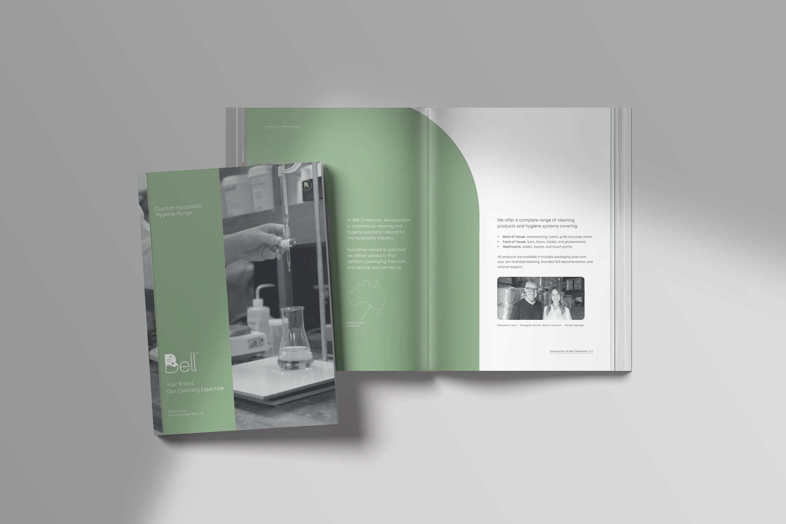
The refreshed identity established a scalable visual system that continues to support Bell Chemicals across print, marketing and exhibition environments.
By refining rather than replacing the existing identity, the brand retained customer familiarity while presenting a more confident and contemporary image aligned with the company's growth ambitions.
Lead Graphic Designer
Responsibilities
Brand Strategy
Logo Refinement
Creative Direction
Photography Direction
Brand Guidelines
Marketing Collateral
Trade Show Design
Stakeholder Collaboration
Print Production